
David William Gentleman, born 11 March 1930, is an English artist who studied at the Royal College of Art. He has worked in watercolour, lithography and wood engraving on projects as large as a mural for Charing Cross Underground Station to logos and postage stamps. I interviewed him for the Correspondence issue of Sentimental Journal about his postage stamp designs for the Royal Mail.
Five decades of stamps
I’m flicking through a small album of stamps my dad gave me. He wasn’t an avid stamp collector, but for a few years, he’d collected Official First Day Covers – stamps on their first day of issue. It was a brief interest, his way of collecting something for my brother and me, for later. I spot a Social Reformer design by David Gentleman, the man I’m preparing to interview. Enjoying the synchronicity of the moment, I dial his home number
In all my artworks, I haven’t had a goal as such. I just went where the work took me.
David Gentleman
As a stamp designer for five decades, David Gentleman has had 103 designs accepted since the Royal Mail selected his designs to mark National Productivity Year in 1962. He has designed more British stamps than anyone. Douglas Muir, Curator of Philately at the British Postal Museum & Archive, described Gentleman’s stamp design work as “supremely important.”
After introducing myself and thanking David for his time, I ask him if the sound quality is good, “I’m going deaf”, he replies. David is 91 years old. I adjust the volume and speak a little louder. I’m nervous, even though he is very forthcoming. I ask him if this interview request from the Netherlands relating to his work in stamp design doesn’t bother him. I can almost hear a smile form on his face as he quietly replies, “I don’t mind, I’m a reasonable person.” I relax and ask my next question.
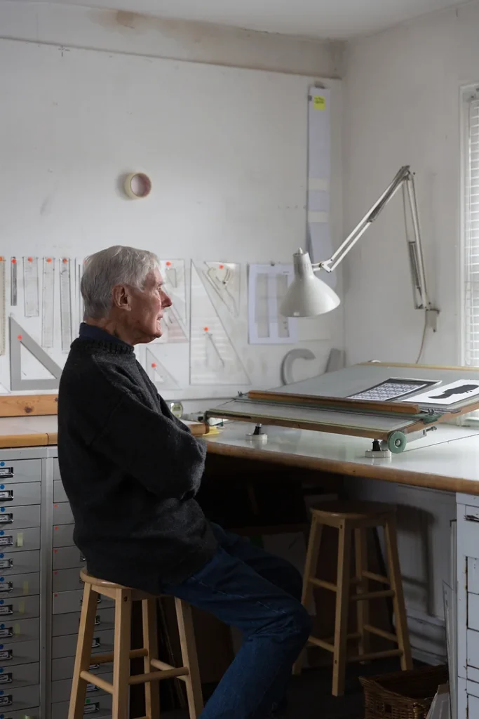
After graduating from the Design School at the Royal College of Art in London, Gentleman took commissions and assignments as a freelancer. His first assignments included wood engravings for a small book about wine, a large lithograph in cafes, and a poster for London Transport. At this time, he also made drawings and watercolours purely for his enjoyment. “In all my artworks, I haven’t had a goal as such. I just went where the work took me. Many of those jobs came by surprise or accident, including the stamp design. It is not something I planned to do.”
Despite this humble explanation, David Gentleman’s work for the Postal Office was hugely significant as many regard him as responsible for making the British postage stamp modern. Until he arrived on the scene, stamp design had been somewhat reverential, abiding by many rules, but when Tony Benn was appointed Postmaster General, he invited the public to suggest improvements. Gentleman wrote a letter of suggestions which marked the beginning of a change, as his work ultimately modernised the appearance of stamps in England. It was a bold letter, suggesting two things; to do away with the restrictions of the Queen’s head and address the lack of interesting subjects. “The most difficult to incorporate was the Queen’s head. It was a photograph by Dorothy Wilding with the Queen looking out at a three-quarters point of view. It didn’t sit easily with another picture or design and caused visual limitations. So I looked for a solution. With my first design, I put the Queen in an oval shape, which seemed more formal. Next, I tried to cut the neck off to make it a smaller image, and then I wondered whether I could leave it off altogether.” The solution was to create a wood engraving of the profile on the current coin and use the silhouette image. The Post Office were shocked. “I don’t feel that I was radical, but my work was certainly radical to the Post Office and that didn’t bother me. I had already designed two sets before I wrote that letter. So when I didn’t hear anything after sending the letter, I thought that it had been a waste of time. Then after some weeks, Tony Benn rang up and invited me to a meeting. He was very accessible and easy to get on with, and we became very good friends.” Based on these suggestions, Benn asked Gentleman to design 100 stamps to prove this idea would work. It was revolutionary for that time, and the themes included wide-ranging historical moments and achievements in engineering to British wildlife.
One of my designs left the Queen’s head off altogether.
David Gentleman
“I just wanted to make good designs that would be more interesting than the ones they were making. As a boy, I collected stamps for a while, and I always found those with pictures more interesting than portrait heads.” In his stamp designs, he returned to using more illustrations and making stamps more interesting. Indeed, one of his personal favourites is the Battle of Britain sheet, also primarily inspired by a moment in his childhood. “I was a schoolboy at the time of the Battle of Britain. I knew the silhouettes of those planes. So rather than drawing or painting them pictorially, I created these overlapping silhouettes, choosing different colours to create an effect.”
David Gentleman’s work in stamp design communicated big ideas in a tiny space. He made many different subjects look simple but beautiful. How did he become a master at designing stamps?
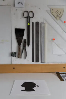
“You’re given a subject and told the size and what it had to include; the title, the denomination, the Queen’s head. You then just think about it, do some rough designs, and then a finished one, which is essayed (proofed) by the printer and amended.” Hearing this you would be forgiven for thinking the design process is straightforward. Unfortunately, the Design School did not teach stamp design, so he learned by looking at foreign stamps that he considered more interesting than most British ones and then working out what was possible. The stamps that made an impression were all pictorial, including some big Swiss and French ones and some from the British colonies as they still were.
For the Churchill series, the stamps were designed in a few days, soon after he died, and printed and issued as quickly as possible. “One of my designs left the Queen’s head off altogether. I was advised to separate the Queen from a commoner, so I added a white line. Unfortunately, it didn’t translate well on the printed stamp. As a result, there is a slight wiggle in the line. I wouldn’t do it like that again.”
Gentleman didn’t shy away from politics and controversial subjects and he explains that although changes are part of the development of a design, there were also times that he resisted requests for changes. For example, the 1986 Ecology and Environment issue designs showed the contradiction of things that threatened the environment, one was a polluting power station with a fish in a nearby lake. The Stamp Advisory Committee approved them, but Mrs Thatcher’s politics did not. “I was invited to redesign them in a more industry-friendly manner. I politely refused, as I felt this would have destroyed the point I wanted to make.”
In the late 1970s, I stayed on Nauru, a tiny tropical mid-Pacific coral island, twelve miles around. I was there to design a set of stamps.
David Gentleman
At my desk, I look at the Social Reformer stamps again, printed in the year I was born. I feel that although he wouldn’t regard himself as an ‘activist artist’, the small resistances David made were clearly his way of making a point. One which he also made on a larger scale when he designed many effective protest placards for Stop the War’s marches against the Iraq war. “My first really activist designs came in ‘A Special Relationship’, a book about Anglo/American relations I did in 1987, which incidentally included a parody stamp.”
I ask why his name features on the Concorde stamp design. David tells me that he was out of the country when the design went to print, and the names of each designer had been added without their knowledge, much to his dismay. “I disagreed with the credit because adding the name is a nuisance to the stamp design and goes against my principles of simplicity in design. I was actively looking to achieve a way to express an idea in the simplest possible form.”
David’s artistic career includes an impressive variety of work spanning from the simplicity of stamp design to the detailed illustrations and drawings of urban life in London and abroad. Throughout, he always painted. “In the late 1970s, I stayed on Nauru, a tiny tropical mid-Pacific coral island, twelve miles around. I was there to design a set of stamps. At the time, it was still largely unspoilt, its coral pinnacles were fascinating, and though my contract was to stay for two weeks the island was so interesting that I stayed for three months painting the watercolours that I made into stamps, and my family came to join me. It was unforgettable. But I wouldn’t go back now – all the guano that made the island unimaginably rich has been used up, and it’s now an Australian immigration facility.”
This year, his latest exhibition of watercolour paintings shows his extensive travels under the title ‘On Location’. When I ask him why he consistently comes back to painting, there is silence in the conversation. I wonder if he heard me, and I am about to ask if I should repeat the question, “I’m sorry. I can’t put it into words,” he replies, finally. My parents were both painters, so I have simply painted all my life.”
With thanks to Hilary Casey at Patrick Bourne & Co Gallery.
All Photos by Jake Fitzjones ©
Website: davidgentleman.com
This interview was published in the Correspondence issue of Sentimental Journal magazine.